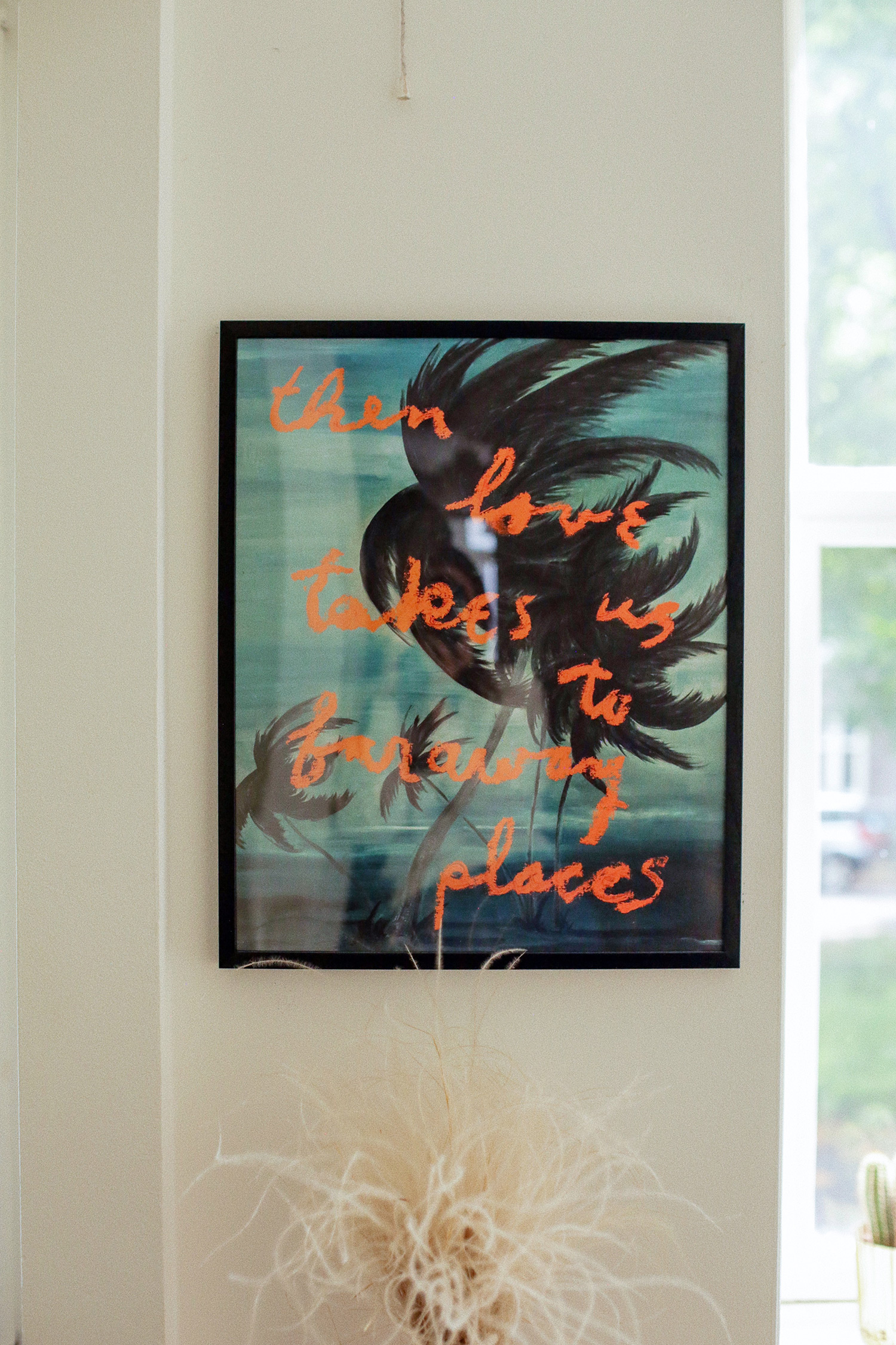


I Can’t even remember how long it’s been since I got asked to do a house tour for you guys. The reason why I had never really done one is because my home decor was kind of a work in progress for a very long time. Fast forward 3 years after I moved into my new apartment and I came across with a new big and amazing change; My boyfriend and I decided to move in together! *Cries in Spanish in a good way hahaha
We looked for other apartments for a while but quite frankly, everything we were seeing was more expensive and not as cool as my current apartment was (also pretty great location). So after scouting Amsterdam for about 6 months, we decided to stay at my apartment and make it OURS. The first thing that came into my mind (and my boyfriend mentioned) was that there was too much pink. My apartment was really a true “single girl apartment” and i love that, but I was also longing to make it grow up a little -I did love my pink velvet chairs but I was not too resistant to let them go-. I have always been EXTREMELY enthusiastic about interior design (I actually studied that at University), so whenever I get the chance to decorate, my creativity really goes wild.
Moving in together was extremely exciting and it was important for me to create a space that felt a little less ME and a little more US, sort of like pressing a reset button and creating a new space that would fit both of us.
I didn’t have too much space to work with, just because we have 3 enormous closets scattered around the apartment to fit all of our clothes, so that immediately makes rooms a little smaller. I tried to optimise the layout and even though certain features of the apartment remained (like the print wall), I does feel like its a big change!
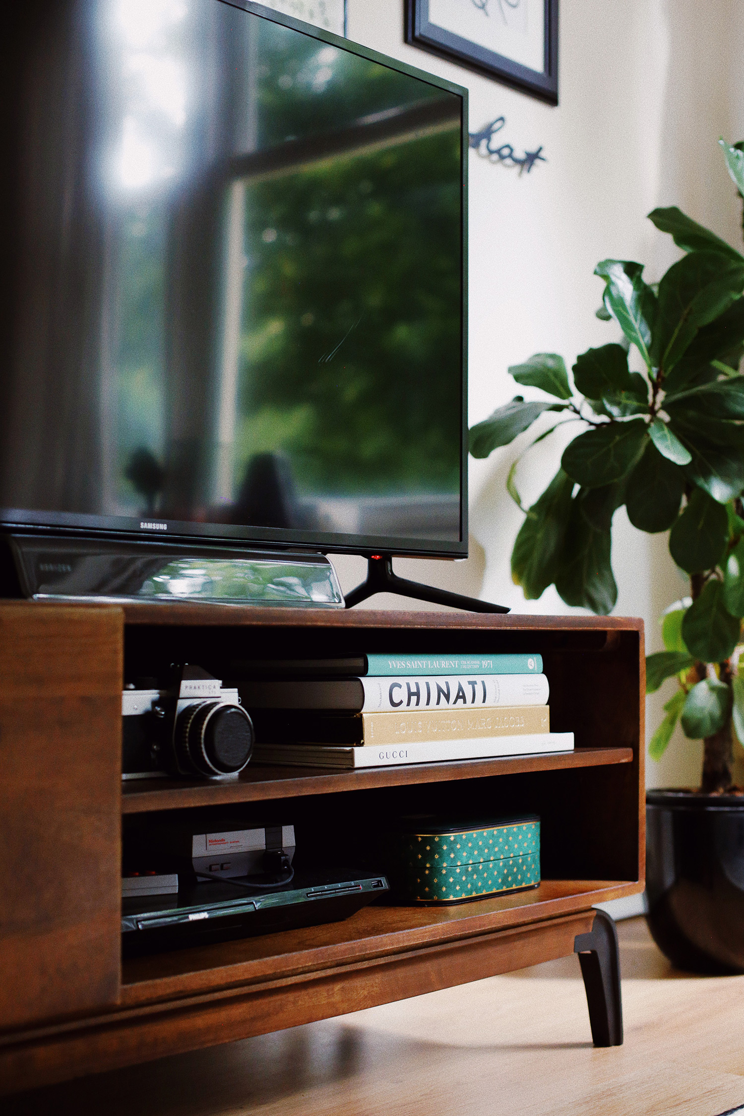
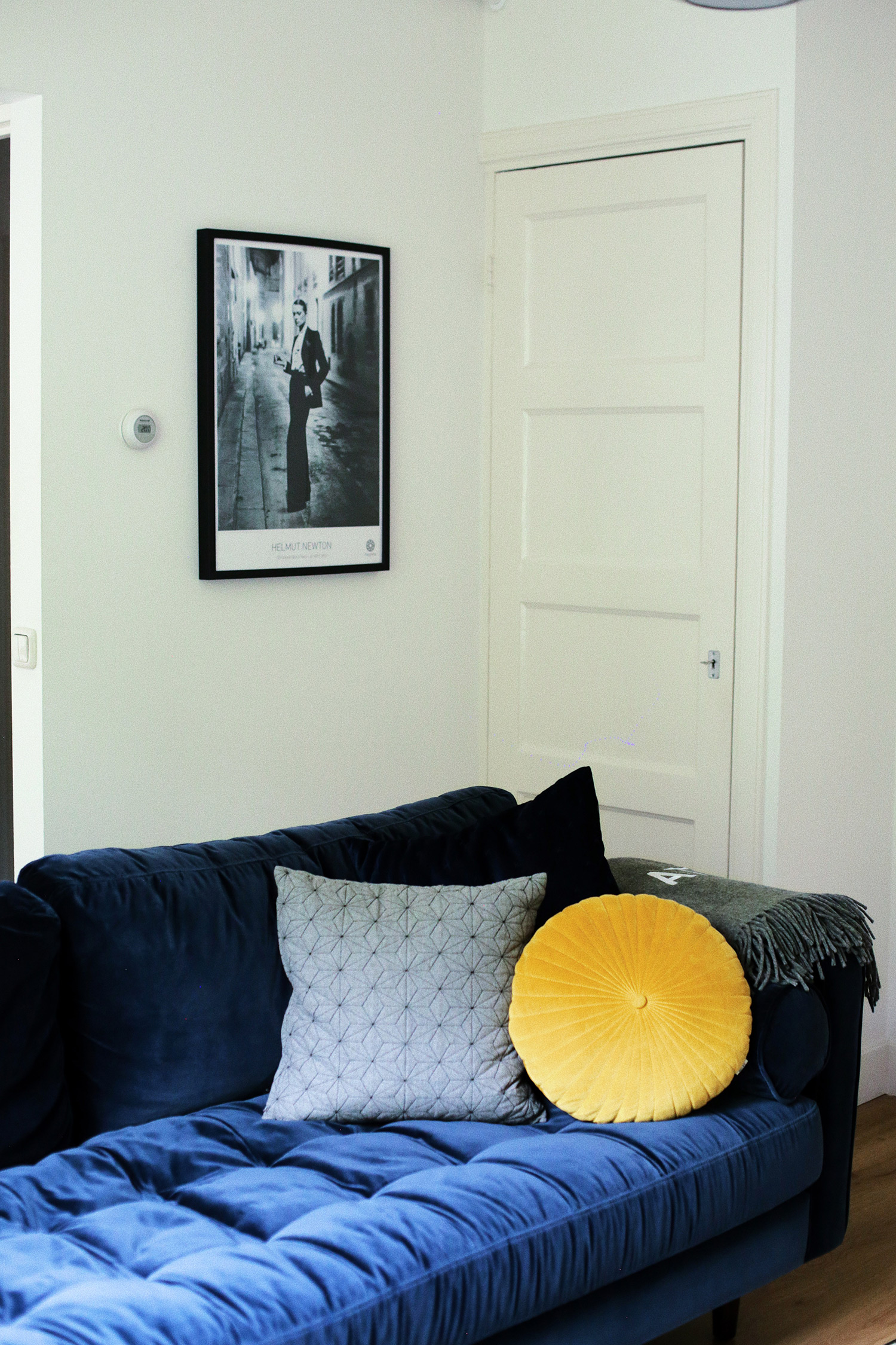
First and foremost, I wanted to get a BBVC “Big Blue Velvet Couch“. You have NO IDEA how long I have been dreaming with having a velvet couch. I wanted to make the couch the most important feature of the room and everything else I picked was complementing that. The TV unit was also a MUST as I have had my TV sitting on the floor since I moved in. The issue was that the cable connectors are in the corner of the room and I simply couldn’t find a cool corner TV unit that fit the measurements of that space, so I just left it and left it until having my TV on the floor became “normal” to me.
I went for this TV unit as I have noticed myself pinning a bunch of TV units that looked like antique wood and this was the most similar to that I could find. It’s interesting how I used to go for a completely different aesthetic in terms of decoration and recently, I am leaning towards velvet, wood and green shades.
“I wanted to make the apartment a little less ME and a little more US”.


Unfortunately we don’t have space for 4 chairs in our small dining room, so we went for these two amazing leather chairs and have two folded ones stored inside a closet for when we have guests coming over. We traded the pink velvet chairs for two black leather chairs and the marble table for this elegant dark glass table (even though we still kept the marble table in the balcony “just in case”). The cutlery and plates are also from MADE.com and are absolute favourites of mine. I chose the cutlery to match the legs of the chairs and the plates match the whole vibe of the living room.


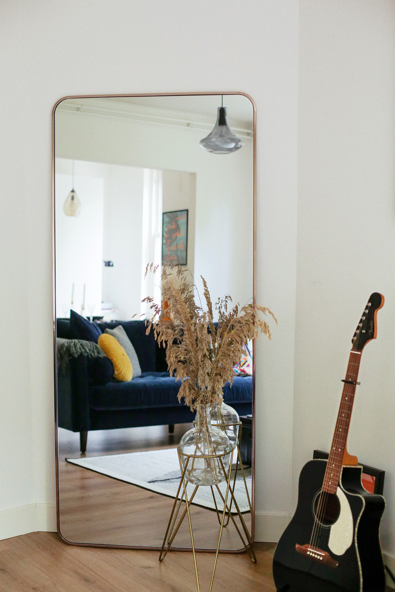
1. COUCH | 2. TABLE | 3. MIRROR | 4. VASE | 5. TV UNIT | 6. CHAIRS | 7. RUG | 8. PLATES | 9. SILVERWEAR
We still have to redecorate the room, but we’re waiting to bring my boyfriends bed over and when it’s in, I pimp that room too! (and of course share).
Let me know what you think and if you want any decoration tips!
The post HOME MAKEOVER WITH MADE.COM appeared first on Stylescrapbook.
from Stylescrapbook https://ift.tt/2KEYouf


No comments:
Post a Comment